
A look on Apple Maps on iOS 10
After a rough start of Apple Maps in 2012, Apple has changed once again how their maps application works and looks. Since competition keeps us strong, I wanted to take a deeper look onto their newest iteration.
Style
The most obvious change in styling is the new font they switched to: Now everything is set in a slightly bolder variant of San Francisco. This gives it a distinct, unusal look, but improves overall legibility. The use of italics is, luckily, very limited as it only applies on waterbodies. Country and state labels are rendered upper-case. Label placement and selection continues to be erratic: Bigger town labels sometimes disappear when zoomed out and are replaced by smaller towns around. Labels on ways are following the underlying paths, which accounts for some weird breaches in longer texts.
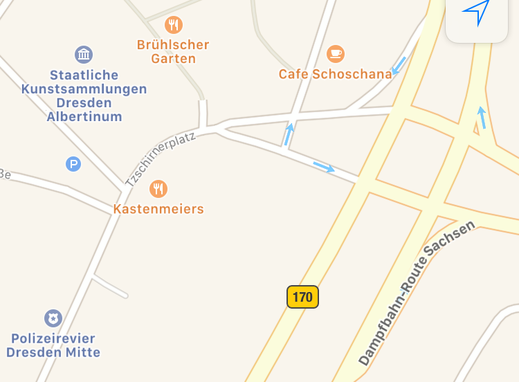
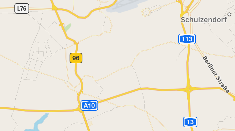
Maps applies some country specific rendering rules, for example state borders (≠ country borders) and their corresponding labels are rendered very early in the US as they are of great importance there, but are hidden much longer in Germany, where they are less important. Motorways have a blue styling in Great Britain, while the German Autobahns do not have a distinctive style. That way it is not possible to distinguish those from other streets of lower rank - at least not while zoomed out. When zoomed in they receive shields which even incorporate correct colors, depdening on country and type of street. In some cases the Autobahn identifiers include a leading A, which is non-standard on shields.
UI Elements
Apple switched to a different scheme, which focuses on quick access and automatic suggestions. First of all, there is now a big map view with only two buttons at the top (more about it later), and an expandable input/selection view at the bottom. One completely new addition is the location sensitive weather condition and temperature indicator, which I have not seen anywhere else before, but seems like a useful addition.
Button Section
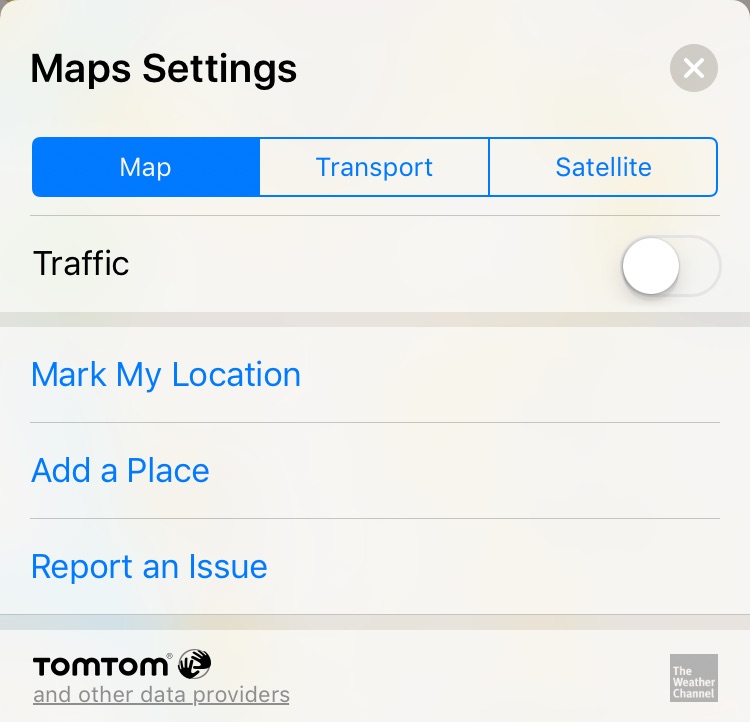
There is the location button, which works like before: single tap brings you to the current location, another taps rotates the map depending on the compass info. Above that one the (i) button resides, which could be described as the miscellaneous button as the menu includes the layer switcher (map/transport/satellite) as well as data improvement or error reporting functions.
Search View
On the lower end of the App there is the search view, including an input bar, which reveals POI category search on tap. Below this there are the context sensitive locations: work place or home, including travel time. This defaults to “drive” routing even if you never get there by car. The routing mode can be switched after selection. In my location (Dresden), switching to “transport” mode (public transport) produces a loading spinner for a few seconds and returns a result suggesting to walk for 35 minutes to the destination. If you happen to have a car, it will try to remember its parking position and will display it in the suggestion list. This works even in non carplay vehicles, I am assuming it is using a combination of Bluetooth scanning and movement data - very neat.
The text search for locations, also known as geocoding, is continuing to be one of the hardest problems. The Maps App has reached an acceptable level. Searches have a reasonable location bias, so typing a street name will return results close to your current location. City look-ups can be performed in local, native or even foreign language. Warsaw, Warszawa and Warschau will all point to the capital of Poland, with the exception that it might show up on second position, just after the city’s international airport. One of my favorite tests is typing “Mona Lisa Paris” (for people who forget that the museum is called “Louvre”) into the search. While having rather bad results from Google, returning permanently closed restaurants outside of Paris and on the other hand having a brilliant result from OpenStreetMap’s Nominatim, which returns the exact position of the painting inside the Louvre, Apple only knows about Pizza places in Paris called “Mona Lisa”. Sad, but not unexpected.
Routing
I am not totally sure how to feel about the car turn-by-turn navigation, at least until now, maybe I have to use it for a few more weeks. A big plus is, of course, the integration of routing into the system. Special notification type, lock screen support, haptic feedback on the Watch, Apple’s own App can have it all. Voice commands are pretty clear, even if they are sometimes too frequent. If you have to perform a lot of turns one after another, there will be a constant talking. One thing I always liked about the speech output was the mention of destination: “Turn onto X street” or even “Merge onto X in direction of Y”, which can help a lot, if you want to keep your eyes on traffic and look a street signs. One peculiar thing: It is pronouncing all street names in the system langauge. “Schönefelder Straße” prounounced by the english voice sounds very entertaining.
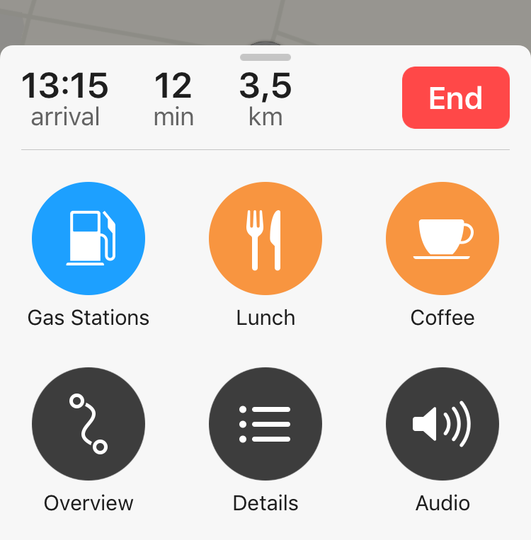
The on-screen controls are very good: As soon as it switches to routing mode, there is only one button, which is for ending navigation. Very handy, if you just want the instructions to get out of town and then continue driving without instructions. Everything else is hidden in a bottom menue, which includes buttons for finding near-by petrol stations and restaurants. You can also enable detail view and change audio settings.
Conclusion
After Google and Apple parted their ways, Google Maps was dominating the mobile map space without meaningful competition. But things are changing: Apple continues on improving and especially enhances the user experience by focussing on the hot usage paths. Public Transport data is still lacking, but this is already know as a tedious, long process. In general, the map design is very pleasant to the eye. Labels are odd, but this is no news and a discipline where no one reaches absolute perfection. Map data is still not great everywhere. POIs that do not exist for several years are not uncommon, but at least user feedback is taken seriously and reports are handled in a matter of days, not months. There is still a lot of work to do, though. As long as you are not reaching some data white space, Apple Maps has become a resonable choice.